
PASTEL POP! PASTEL COLOURS FRESH FOR SPRING
Soften a room and create a fresh feel with the ever popular pastel trend. Often people associate pastels in home design with nurseries or children rooms. But with the right designer, these beautiful colours can make a strong statement in any room.


Using pastels in statement pieces like a sofa or drapes can add life into any room. Fall in love with sugar shades such as blush and powder blue, or celebrate Spring with lime and citrus hues. Life in pastel is anything but boring.

CHROMOTHERAPY - THE COLOUR THERAPY TREND FOR 2021
Colour therapy, or chromotherapy, is a widely used concept in interior styling. It is also commonplace in other industries, including marketing and hospitality. In fact, research has even shown that restaurant patrons are more likely to eat larger portions off a red plate than a blue plate! Applying this concept to your home means that every day you can subconsciously alter your emotions.
A complete paint work overhaul is not necessary to jump on this trend; even the right white can be a powerful and refreshing colour choice for a wall. However, some key styling tips and colour combinations will go a long way in boosting those good feels in your home.


Get To Know The Colour Wheel
The colour wheel is a universal tool to show the relationships between colours, so it can be useful in learning about colours that complement one-another. Typically, you’ll find complementary colours on opposite sides of the colour the wheel. An on-trend pairing example is indigo blue and crustacean. The blue evokes grounded feelings of calm and relaxation, while the crustacean orange/pink can help to give you increased energy and proactivity.
Styling Palette


We suggest you begin with a blank canvas and select your palette based on colours that resonate with you! You then have a good framework to work within when choosing which pieces for your space. Great interchangeable décor items you can swap out depending on your mood and the season includes cushions, artwork, vases, candles, occasional chairs, throws and coffee table books.
Different Room, Different Energy
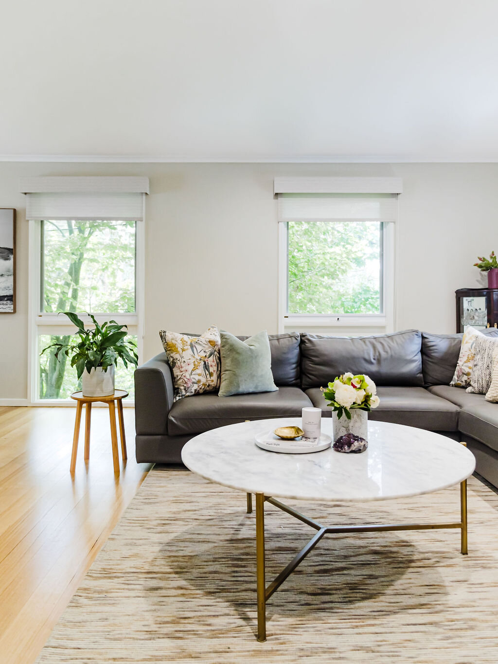
Everyone loves a good story, and your home should tell your story! You don’t have to stick to one set of complementary colours throughout your entire home. In fact, each space should speak to your personality and each space should spark a different kind of energy. For example, blue and crustacean in your kitchen and living space (just like this home in Cheltenham) will allow for socialisation, serenity, and openness.
Colours like forest green or marigold yellow in the bathroom will bring tranquillity, optimism, vitality, and peace. Oh, and if you’d like to get the kids to sleep soundly at night, various tints of blue, sage, pink, and white will be your best choice for their bedrooms.

INFLUENCING EMOTIONS WITH COLOUR AND ART
Did you know your mood and emotions are constantly influenced by your surroundings? You may not realise it at the time, but if you begin to take note of the spaces that uplift you and those that leave you wanting, you might find a pattern begins to emerge.
In 2021, as we spend more and more time in our homes amidst lockdowns, we’re craving mood-boosting spaces in our home more than ever. Here, art plays an important role.
Art is a form of expression and has been recognised by healthcare professionals as a type of therapy. It has also been scientifically proven that colour affects mood, so many homeowners notice an effect when changing home interior colour schemes and artwork decor. This is important, as an image of pain will have conscious or subconscious impacts, just as a happy photo of bright flowers bathed in sunlight will. In short, your chosen colours and artworks matter. Read on for some of the ways art in your home can effect you and your mood on the daily.
Art Therapy
Art therapy is a therapeutic discipline with roots in both art and psychology, developed in the mid-20th century. Its practice revolves around enabling people to overcome physical, mental, and emotional disabilities and trauma.
The proper application of this therapy has been found to provide patients with an alternative method of communication when verbal interaction is not feasible. Emotions such as fear, stress, anger, happiness and many more can be portrayed in the images that are created by the patient undergoing art therapy. The non-verbal communication is a great asset to patients who are not able or uncomfortable talking.


Influence of Colours
Colours in art can also be used to change or enhance your mood. Lively colours will often give a person a feeling of generally having more energy, while darker colours can bring a sense of melancholy.


Four Primary Colours Defined by Psychology
Red is thought to be a very physical colour, bringing to mind both negative and positive overtures. It is often thought to be masculine, aggressive and strong.
Blues are linked to an intellectual response, by providing a calm, reassuring, even cold reaction in people.
Yellow is often associated with friendliness, but can also elicit thoughts of depression and give the impression of fragility.
Green shades are perceived as a balancing colour. It brings to mind peace, rejuvenation, but by some triggers a feeling of blandness.
Choosing Art
Art can elicit any number of different emotions in a person. The same image can even produce different moods in two people looking at the same piece. Your taste in art is as personal as the work itself.
Of course, works of art are not limited to paintings, but also include sculptures, name art, photos and sketches. What is important is how it makes you feel when you look at it. If you are seeking pieces of art that will uplift your mood, choose those items with colours that make you happy.
We love when clients have images that bring good memories to mind and will always try to incorporate these into the interior design. Its all about turning houses into homes, and happy homes at that.

FLOATING SHELVES: THE WHAT + THE WHY
When it comes to shelving, floating shelving displays have become a popular choice seen throughout modern interiors, emphasising clean lines and a minimalist aesthetic. Inspired by their hidden brackets and suspended form, we love how a floating shelf can perfectly fill a blank wall and compliment contemporary spaces.
They also work no matter how much wall space you have since they only really require vertical real estate. Aside from making sure everything you need is within reach, floating shelves also just look great. Not to mention, they introduce dimension to otherwise blank walls.

In this kitchen space we designed, the floating shelf houses some natural greenery, but could just as easily be used for storage or display. As always, form meets function in the most beautiful of ways at Melissa Lunardon Interior Design.
SWOON-WORTHY SHELVES
We don’t know about you, but we are feeling inspired to stack, straighten and arrange with these swoon-worthy built-in shelves from our Williamstown II house design!

Shelves are an easy way to elevate the design of any blank wall while maximising storage space. Take it to the next level with floor-to-ceiling, built-in bookshelves like these, where you can not only organise your precious possessions, but display your personal style through travel knick-knacks, artwork and beyond.

SCULLERY OR BUTLER'S PANTRY: WHAT IS THE DIFFERENCE?

In modern home design, a scullery or butler’s pantry has become a ‘must-have’ feature for those who like to entertain. But what’s the difference between a scullery and a butler’s pantry?

In general terms, a scullery is another small kitchen in itself. It will have space for food preparation, cleaning and washing. It is great for people who like to entertain and a perfect space for caterers to work from in your home. A key attraction of a scullery or butler’s pantry is that it provides a space to hide all of the dishes and mess while the main kitchen is being used as the entertaining hub for serving food and drinks.

The scullery kitchen will also allow you to increase the capacity of your kitchen to cope with cooking for a crowd. While this is fantastic for entertaining, it is also great for larger families or if you have extended family come over for meals frequently. Alternatively, it can be great for couples where you both like to cook, but need your own zone to work in.
A butler’s pantry tends to be a more modest affair and is smaller than a scullery and is usually more of a storage zone with a small preparation area. Effectively, it is a walk-in pantry that may also have storage for small appliances such as toaster, kettle, microwave and limited bench space for food preparation.
Sometimes a butler’s pantry also includes plumbed facilities such as a sink and a dishwasher. This is where the line between a butler’s pantry and a scullery start to blur.

In practice, the terms scullery and butler’s pantry are often used interchangeably. Basically, they both refer to a space that is used as a mini-kitchen of sorts. The features, appliance, space and storage that are designed into the room are generally governed by how much space is available on the floor-plan, balanced against what the homeowner can afford in their budget.
The inclusion of either a scullery or a butler’s pantry in your home renovation is certainly a modern-day luxury. One thing is certain, those that have them, love them!

TOP TILE PICKS IN 2021
Our latest blog post chatted with Vilma Pisano from Lifestiles about all things tiles in interior design. By popular request, here are Vilma’s top tile picks across a range of popular categories! Feature tiles, large format tiles, timber tiles, bluestone, textured tiles and more - if you’re looking for the optimal tile solution in 2021, this is your go-to.


ALL THINGS TILES! WORDS WITH VILMA PISANO FROM LIFESTILES
In the August issue of The Design Journal, we were delighted to chat with Vilma Pisano from Melbourne-based Lifestiles, one of Australia's leading tile experts! Here is a Q & A that talks all things tiles. We hope you enjoy these words with Vilma Pisano.
What made you fall in love with tiles?
We love fashion and tiles are a part of the fashion industry, plus tiles are constantly changing! We have new products and designs arrive every week. It is ever-evolving so every day we are creating new ideas and concepts for clients.
What is the biggest change that Lifestiles as a business has made in the last 5 years?
We have concentrated more on our retail presence, enhancing our showrooms to give our clients the creative inspiration and service needed when viewing tiles.
What direction do you see Lifestiles heading in over the next 5 years?
Our intention is to have a wider brand awareness online, while maintaining our unique innovative products and service.
What makes the tiling industry in Australia unique compared to other countries?
Australia has developed its own individual style that reflects our unique way of life. This is especially evident when it comes to colour and texture, which draws inspiration from the rich Australian environment. From beaches to the desert, you see Australia reflected in an array of styles, colour and everchanging landscapes of tiles.
What is the best piece of advice you have ever received in relation to business?
Stay ahead of competitors by offering innovative products and great service.
What is the best piece of advice you have ever received in relation to tiles?
Tiles make a long term design statement!
What is the best piece of advice you have been given as a woman in business?
Our father always told me there is nothing you cannot do. He was adamant you should treat everyone, the way you would want to be treated. He taught me that in life you need to be resilient, always try and never stop learning.
What is the hardest thing you encounter as a woman in business?
When I started working for the family business it was a male dominated industry. Women needed to prove their knowledge and gain respect. This is why Lifestiles makes sure that all staff members, including our female staff, know how to tile, grout and have hands-on knowledge about the products we are selling.
How have you seen the COVID-19 pandemic influence the tile industry?
It has caused issues to our supply chain in delaying shipments of products. It has also put pressure on us from customers wanting to access our products online. The challenge for us is the fact that it is only during the lockdown period that demand is high for a digital tile library. When able to do so, customers prefer to come into our showrooms to touch and feel the products. The uncertainty and extra demands this places on us as a business is very real; it's impossible to know when demand will swing and how to best prioritise resources.
What changes have you seen designers adopt due to to the COVID-19 pandemic?
Designers have become more reliant on online selections. Social media has also increased in necessity and impact in communicating with clients and conducting business with suppliers. We love that the pandemic has also seen higher demand for eco-friendly and Australian products.
What is the best innovation that you have seen positively influence tiles as a product?
Social Media has probably been our biggest and best influencer that has generated positive interest in not only our product range but also our brand awareness.
Tile trends you're glad to see the end of?
None. I love all tiles, past, present and future. Each one has enjoyed it’s time in the limelight. I love how it gets refreshed in a new way each time it makes a comeback.
What is the biggest and best trend in tiles you have historically seen positively impact interior design and homes in Australia?
We have enjoyed seeing a shift away from the safe contemporary beige and grey colour ways towards more colour and style diversity. We see styles from Hamptons to Scandinavian and many others. Australian designers excel at embracing new trends with a unique Australian touch to it.
What is the one thing you wish everyone knew about tiles?
There are so many things I wish people knew about tiles, but it all comes down to versatility. Tiles can be used internal and external, there is a massive and increasing variety of styles, shapes and finishes available, and there are ever-evolving ranges and improvements.
Top tile trends you predict for 2022?
More colour and texture with shape, size and variety of finishes. We are already seeing the rich reds from terracotta flourish in popularity. In addition, natural earth greens and beautiful rich blues are making a comeback. It is so great to see people embrace COLOUR!
What colour ways work best in home interiors?
At present, I am loving the fact that Australians love using colours. Gone are the days where we only used peaches and cream - our choices are so wide and varied now. At the moment, we are still seeing warm tones used effectively in homes and retail spaces, often alongside timber. Another fabulous colour way is a neutral palette with splashes of black, white or soft greys. Another style we see work really well is the injection of colour into a white/grey palette. Then of course are those fabulous interiors that generate intensity with dramatic colours and intricate details. Moody styles with colour in tones of charcoal, blacks and hues of greys are also very successful. And of course, classic colour ways are always a win, particularly washed whites on whites with hints of timber cabinetry and matt gold details to add warmth.
What is an unusual use of tiles you have seen?
In Australia it would have to be the Sydney Opera House, which used porcelain tiles. Internationally, I love the use of tiles when museums and designers/artists create one off spaces for an event, especially in Venice when they used these huge rectangle structures in 24 carat leaf- gold mosaics from Trend Mosaics. These tiles were used in high columns just over the water from St. Mark’s Square, called “The Sky Over Nine Columns”, and they were absolutely stunning.
What differences, if any, do you see in the design and use of tiles within commercial settings compared to homes?
In commercial space, particularly the hospitality sector, we find designers creating individual spaces and being much bolder with colour and texture. With Residential homes the focus is more on clean lines with highlights in shower areas or vanity areas for texture change. Although I must say that we are becoming more creative with our tile choices in our homes and where we place them.
What is the most common mistake you see people make when tiling their homes?
Not utilising the space of the room in an effective way.
What would you love to see more people do with tiles in their homes?
I’d love to see people be more creative with their internal walls. For example, tiles can be great for entry walls, family room walls and bedroom walls. I also love to see tiles used to create shower ledges in bathrooms, instead of niches. Tiles can also be extraordinary used externally, such as timber tiles on facades of homes. Outside can be a highly visual space, so it’s a great opportunity to be bold with tiles and design tiled alfresco and BBQ walls. Just step outside of your comfort zone and be creative, incredible designs with really functional and artistic expression awaits those who dare to tile where others don’t.

LIFESTILES - AN AUSTRALIAN BUSINESS WITH HEART
In the August issue of The Design Journal, we featured one of our absolute FAVOURITE suppliers - the Melbourne-based Lifestiles, who supply the most incredible range of quality tiles to Melbourne and surrounds. Finding the right suppliers and products for your build or renovation is key to ensure a quality result delivered on time and on budget. It was an absolute pleasure to chat to the Lifestiles team, so today we wanted to showcase them here on the blog as well.

Lifestiles is a family-run business founded in 1978 by Joe Brunato in Melbourne,. Over time, Joe and his family became one of the leading tile distributors in Australia, expanding into wholesale and supplying over 200 businesses Australia wide. Incredibly, the business has remained family-owned and operated for more than four decades. Through time, and with the sad loss of their patriarch in 2008, this unique Aussie business chose to focus on their biggest passion; working directly with clients in a retail showroom to bring a newfound level of creativity to the artform of custom tiling.
If you visit the Lifestiles showroom you will see homage paid to Joe with a wall of history, showcasing images of the Lifestiles family past to present. The showroom even features a plaque with an original tile from when Joe first started in the tile business. This is a business with heart, and a heart that is solely secured by small but meaningful materials of construction. Here more than ever, the humble tile takes on a meaning and an artform beyond its mere function. At Lifestiles, tiles are literally life.
You can find Lifestiles showrooms in Werribee and Glen Iris, Victoria, as well as a selection of the range online. It was an absolute honour talk to Vilma Pisano, one of Joe’s daughters, about all things tiles in one of the most fascinating discussions we’ve had about the incredible artform that is tiling.
SPRING TRENDS TO EMBRACE IN 2021
On the eve of Spring 2021, we look at new season interior design trends you may wish to consider as the weather warms! Spring is the perfect time to embrace new design themes and update your interior for the months ahead.
If you love the sound of one of these interior design trends but you’re not sure how to incorporate it into your home, chat to Melissa Lunardon Interior Design about how the team can help you! Spring is a great time to have fun with interior trends without being a slave to them.

Curves and circles
.Curves are back in a big way this spring. They are a great way to break up all the rectangles in a space and we are seeing them in everything throughout interior architecture. You can easily embrace this trend in your own home with items like arched mirrors, rounded bed heads and accessories with semi-circle elements.


Statement tiles
Inspired by traditional Italian and Spanish design, statement tiles will make a big comeback this Spring. This trend is all about embracing a tile with colour and pattern. Look for tiles in shades of sage, terracotta and smokey blue to create a spa-like experience at home.

Dark marble
Marble is an enduring favourite for interiors and it is a material that translates well across many rooms in the home, including tiles, benchtops, coffee tables and accessories. For a fresh take on an old favourite, make a statement with much darker tones like black, deep red and bottle green.

Mustard hues
Mustard yellow is a fashionable colour for interiors this season. You will be surprised at its uncanny ability to work with most palettes. Mustard gives depth to pale pink, helps a smokey grey sofa pop, and is the perfect foil to a largely white room, providing an often needed focal point. It can be as simple as a throw on the sofa or an artwork featuring some mustard tones.


We hope these tips helped and you have a wonderful season of Spring ahead!
BRAVE AND BOLD FRONT DOORS
Front doors are a great place to be bold with colour, as it’s one of the strongest features of the home. You are only limited by how brave you want to be – the colour choices are endless! We love how mid-century modern got a punch of colour with this bright yellow doorway in Altona. It really stands out against the white facade and adds huge curb appeal and personality.


Inspired? Here are some tips on choosing a colour:
If you have bricks ensure the colour compliments the bricks. Don’t be put off if your home has older style bricks as you can really make a difference to the look of an older brick home with a new modern door in a bold colour.
Think about how often you may have to repaint. Darker colours can fade quicker.
Create mood boards of your facade colours and selected door colour to see which combination you are drawn to most.
Don’t worry if you don’t like the end result – you can try another colour!
