
CHROMOTHERAPY - THE COLOUR THERAPY TREND FOR 2021
Colour therapy, or chromotherapy, is a widely used concept in interior styling. It is also commonplace in other industries, including marketing and hospitality. In fact, research has even shown that restaurant patrons are more likely to eat larger portions off a red plate than a blue plate! Applying this concept to your home means that every day you can subconsciously alter your emotions.
A complete paint work overhaul is not necessary to jump on this trend; even the right white can be a powerful and refreshing colour choice for a wall. However, some key styling tips and colour combinations will go a long way in boosting those good feels in your home.


Get To Know The Colour Wheel
The colour wheel is a universal tool to show the relationships between colours, so it can be useful in learning about colours that complement one-another. Typically, you’ll find complementary colours on opposite sides of the colour the wheel. An on-trend pairing example is indigo blue and crustacean. The blue evokes grounded feelings of calm and relaxation, while the crustacean orange/pink can help to give you increased energy and proactivity.
Styling Palette
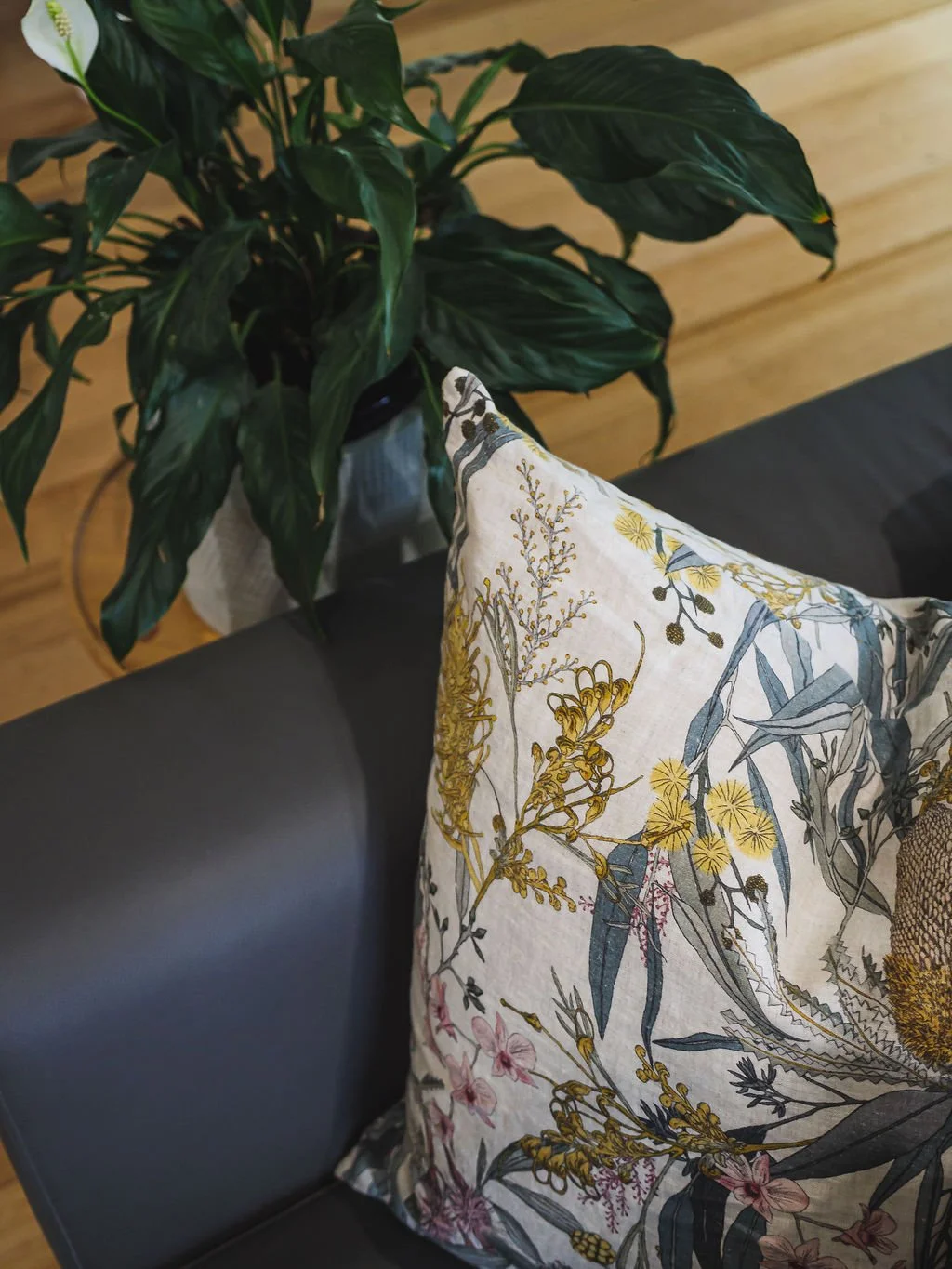


We suggest you begin with a blank canvas and select your palette based on colours that resonate with you! You then have a good framework to work within when choosing which pieces for your space. Great interchangeable décor items you can swap out depending on your mood and the season includes cushions, artwork, vases, candles, occasional chairs, throws and coffee table books.
Different Room, Different Energy
Everyone loves a good story, and your home should tell your story! You don’t have to stick to one set of complementary colours throughout your entire home. In fact, each space should speak to your personality and each space should spark a different kind of energy. For example, blue and crustacean in your kitchen and living space (just like this home in Cheltenham) will allow for socialisation, serenity, and openness.
Colours like forest green or marigold yellow in the bathroom will bring tranquillity, optimism, vitality, and peace. Oh, and if you’d like to get the kids to sleep soundly at night, various tints of blue, sage, pink, and white will be your best choice for their bedrooms.

INFLUENCING EMOTIONS WITH COLOUR AND ART
Did you know your mood and emotions are constantly influenced by your surroundings? You may not realise it at the time, but if you begin to take note of the spaces that uplift you and those that leave you wanting, you might find a pattern begins to emerge.
In 2021, as we spend more and more time in our homes amidst lockdowns, we’re craving mood-boosting spaces in our home more than ever. Here, art plays an important role.
Art is a form of expression and has been recognised by healthcare professionals as a type of therapy. It has also been scientifically proven that colour affects mood, so many homeowners notice an effect when changing home interior colour schemes and artwork decor. This is important, as an image of pain will have conscious or subconscious impacts, just as a happy photo of bright flowers bathed in sunlight will. In short, your chosen colours and artworks matter. Read on for some of the ways art in your home can effect you and your mood on the daily.
Art Therapy
Art therapy is a therapeutic discipline with roots in both art and psychology, developed in the mid-20th century. Its practice revolves around enabling people to overcome physical, mental, and emotional disabilities and trauma.
The proper application of this therapy has been found to provide patients with an alternative method of communication when verbal interaction is not feasible. Emotions such as fear, stress, anger, happiness and many more can be portrayed in the images that are created by the patient undergoing art therapy. The non-verbal communication is a great asset to patients who are not able or uncomfortable talking.


Influence of Colours
Colours in art can also be used to change or enhance your mood. Lively colours will often give a person a feeling of generally having more energy, while darker colours can bring a sense of melancholy.


Four Primary Colours Defined by Psychology
Red is thought to be a very physical colour, bringing to mind both negative and positive overtures. It is often thought to be masculine, aggressive and strong.
Blues are linked to an intellectual response, by providing a calm, reassuring, even cold reaction in people.
Yellow is often associated with friendliness, but can also elicit thoughts of depression and give the impression of fragility.
Green shades are perceived as a balancing colour. It brings to mind peace, rejuvenation, but by some triggers a feeling of blandness.
Choosing Art
Art can elicit any number of different emotions in a person. The same image can even produce different moods in two people looking at the same piece. Your taste in art is as personal as the work itself.
Of course, works of art are not limited to paintings, but also include sculptures, name art, photos and sketches. What is important is how it makes you feel when you look at it. If you are seeking pieces of art that will uplift your mood, choose those items with colours that make you happy.
We love when clients have images that bring good memories to mind and will always try to incorporate these into the interior design. Its all about turning houses into homes, and happy homes at that.
